
24 Aug 2011
WEBSITE
So its been a very eventful summer, which I am yet to post about! But I am collecting and choosing images which will be put up very soon. It's the eve of my friends wedding, so this will have to be short and sweet. For the mean time, I have put some of my work on Cargo Collective, which can be seen at www.cargocollective.com/rebeccafleming
29 Apr 2011
A WEDDING...OR TWO
I can’t post today without mentioning Thee Wedding! I’ve been listening to the Radio 2 commentary all morning; all the build up is so exciting! I’ll switch over to the live streaming online and then I may even partake in a bit of (non-official) street partying! The organisers have put so much effort in and got the whole community involved, but the council and police are adamant that it can’t take place. Such a shame, but hopefully that won’t stop everyone having fun and gathering in a couple of gardens with some cream teas!
Continuing the wedding theme, I thought it would be appropriate to show the ‘Save the Date’ that I designed for my friends Gillian and Derek. The invitation will be along the same lines, but more detailed and formal.

They are getting married in a beautiful castle that dates back to the 1400’s, in Donegal, Northern Ireland. So in contrast, it was important for Gillian that the Save the date represented them as a young and relaxed couple. It also fits in with their decoration theme of an ‘English Country Garden’…or make that ‘Irish Country Garden!?” lol.
19 Apr 2011
TIMBA SMITS
Another Australian gem...Can’t believe I haven’t come across Timba Smits until now. Currently working in London, he combines the retro look with a modern twist to perfection. Humour runs throughout his work, and I especially love the way his clever illustrations read so playfully…check out the pregnancy ad below!
 One of his growing projects is WOODEN TOY…an, as he calls; ‘booazine’ (half book, half magazine). They look like absolutely beautiful publications and I want to start collecting now! I’ve always been a fan of all things rustic, worn and old….so the edge of this particular issue makes me way more excited than any normal person, looking at the spine of a book should be!


18 Apr 2011
COLAB

“Colab is not just eyewear, it's art for your face.”
I’ve been holding on to this wee beauty for months now! I entered the YCN Ted Baker competition brief this year, which was to create a campaign for their Eyewear range. Amongst my research, I discovered the Australian brand COLAB.
Every season, Colab works with a new group of creative’s - producing unique, handmade, limited edition eyewear. The best thing is that only 1000 of each style are produced worldwide! Individually designed by some of the coolest and innovative designers on the planet who include; Mike Perry, EBOY, Stefan Marx and Timba Smits. The images below are sections of the 2011 LOOKBOOK. Each artist/designer has created an art piece that complements the eyewear design and then this has been interpreted through body paint for the photo shoot. BEAUTIFUL! There are backstage videos on the site of the photo shoot – which looks like so much fun!


I'M BACK!

OK, so I’ve had a bit of a break from the blogging: moving across the water, joining a new year group, moving house and all that malarkey are probably no excuses - but oh well! what happens, happens! Writing on the Internet doesn’t exactly come naturally to me, but I’m gunna give it another go! Please bear with me :)
11 Oct 2010
RED OR DEAD
I’ve never really paid much attention to Red or Dead until last week when my mum brought home a pair of new boots, however I couldn’t help noticing the packaging rather than her new purchase. The large box they came in was made of sturdy cardboard and was designed to look like a house front. Inside was gorgeous tissue paper printed with an assortment of objects that you would find in a lavish house. This is a perfect example of how a simple idea and design can inject life back into packaging that would normally be discarded without the bat of an eyelid. It is now sat proudly at the top of my wardrobe waiting to be used. I think I’ll store all my old loose photos in it…safe in my new house:)


If you look closely, the hearts are made up of the recycling arrow. So cute!
+|+|+|+|+|+|+|+|+|+|+|+|+|+|+|+|+|+|+|+|+|+|+|+|+|+|+|+|+
I had a little peak at their website. At first I was a little shocked and confused because there was a medical theme on the home page, the last thing I expected from a fashion brand! But the more I looked at the website, the more I liked it. The ‘Retail Therapy’ theme is taken to the extreme here, but I think it works exceptionally well, as it fits in with their quirky and individual brand values.


A close-up:

‘AND handguns.’? Ha, love it!


If you look closely, the hearts are made up of the recycling arrow. So cute!
+|+|+|+|+|+|+|+|+|+|+|+|+|+|+|+|+|+|+|+|+|+|+|+|+|+|+|+|+
I had a little peak at their website. At first I was a little shocked and confused because there was a medical theme on the home page, the last thing I expected from a fashion brand! But the more I looked at the website, the more I liked it. The ‘Retail Therapy’ theme is taken to the extreme here, but I think it works exceptionally well, as it fits in with their quirky and individual brand values.


A close-up:
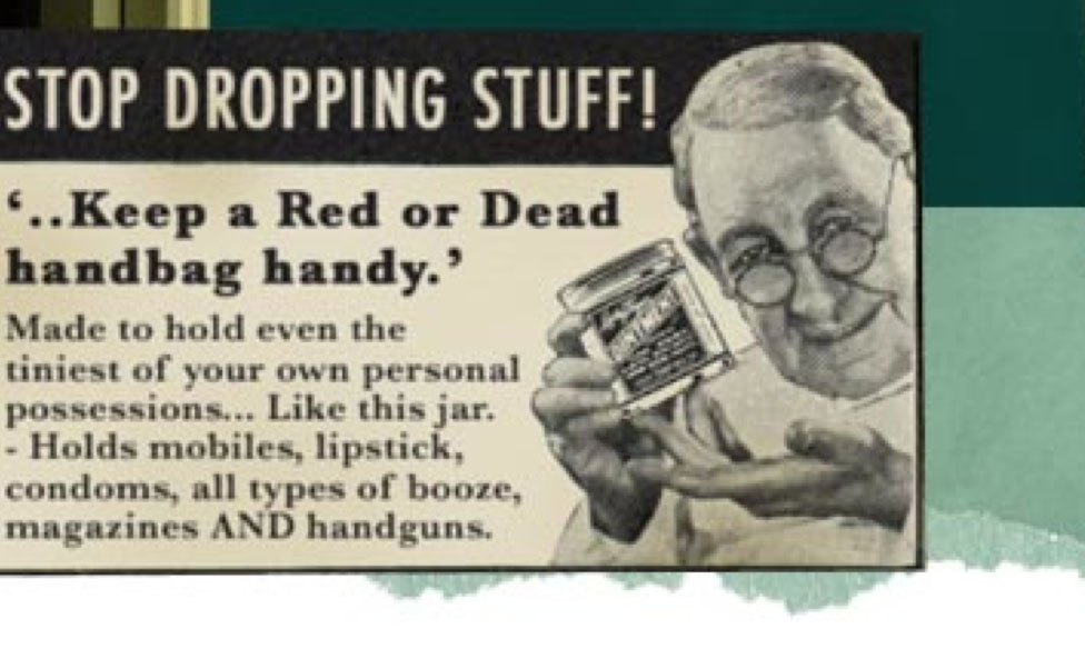
‘AND handguns.’? Ha, love it!
5 Oct 2010
WEDDING FEVER
 +|+|+|+|+|+|+|+|+|+|+|+|+|+|+|+|+|+|+|+|+|+|+|+|+|+|+|+|+
Aghh! Two of my oldest and most amazing friends are getting married! Eight years together and now they are officially tying the knot. I’m SO excited and unbelievably honoured to be one off the bridesmaids. A couple of days ago I seen Gill try on wedding dresses and I shed a few wee tears. Absolutely stunning. Gill, you have an amazing vision of how you want the big day to turn out and I hope everything you dream of comes true. But for now, I have to show off this amazing invitation! I love Matt Dorfman's work and his wedding invitation is so clever and unique, it tells such an amazing story. It's my fave so far, but I think something inbetween this and something more classic would be perfect for you both. Cannot wait for more wedding planning! x x x

Subscribe to:
Posts (Atom)