I’ve never really paid much attention to Red or Dead until last week when my mum brought home a pair of new boots, however I couldn’t help noticing the packaging rather than her new purchase. The large box they came in was made of sturdy cardboard and was designed to look like a house front. Inside was gorgeous tissue paper printed with an assortment of objects that you would find in a lavish house. This is a perfect example of how a simple idea and design can inject life back into packaging that would normally be discarded without the bat of an eyelid. It is now sat proudly at the top of my wardrobe waiting to be used. I think I’ll store all my old loose photos in it…safe in my new house:)


If you look closely, the hearts are made up of the recycling arrow. So cute!
+|+|+|+|+|+|+|+|+|+|+|+|+|+|+|+|+|+|+|+|+|+|+|+|+|+|+|+|+
I had a little peak at their website. At first I was a little shocked and confused because there was a medical theme on the home page, the last thing I expected from a fashion brand! But the more I looked at the website, the more I liked it. The ‘Retail Therapy’ theme is taken to the extreme here, but I think it works exceptionally well, as it fits in with their quirky and individual brand values.


 A close-up:
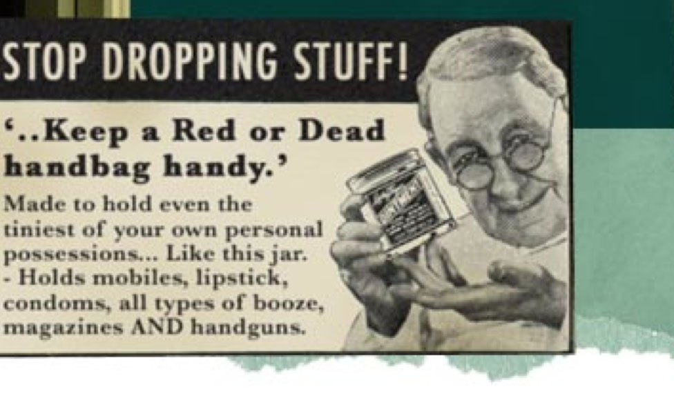
‘AND handguns.’? Ha, love it!